Full Rebranding
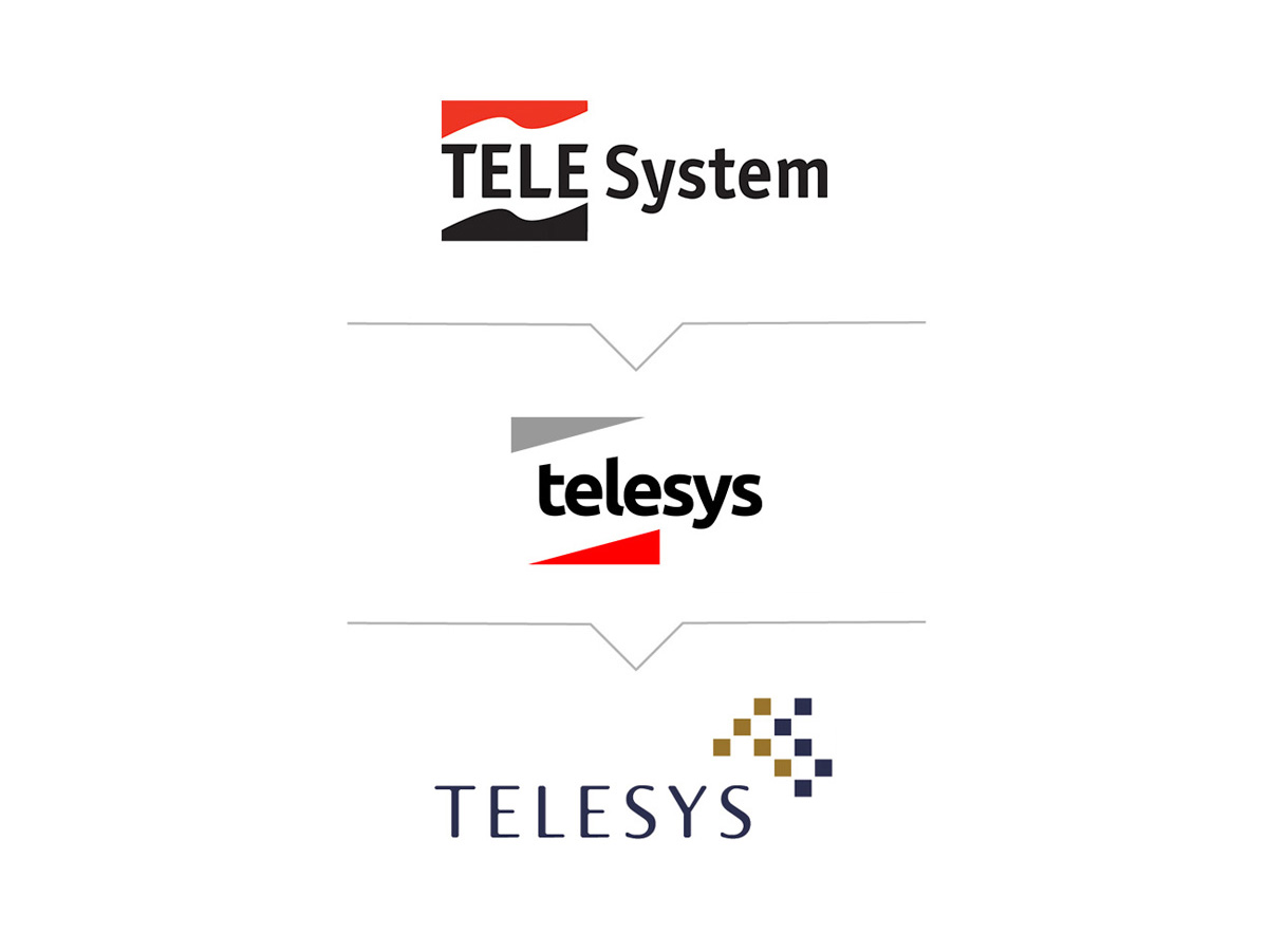
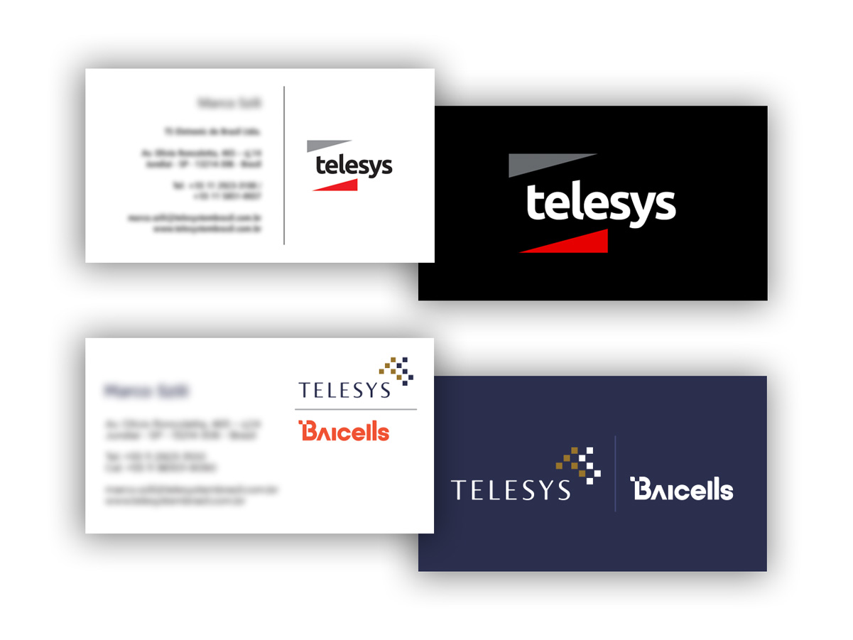
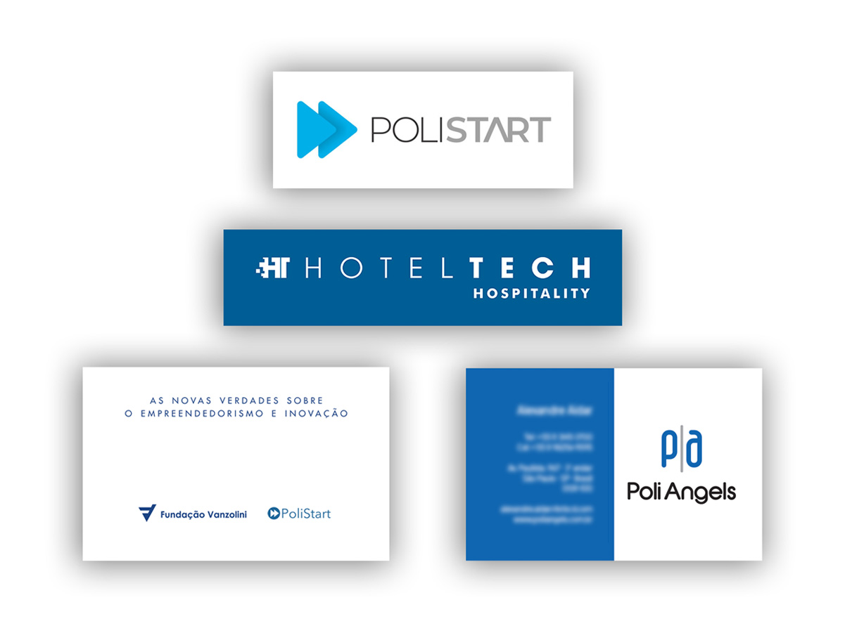
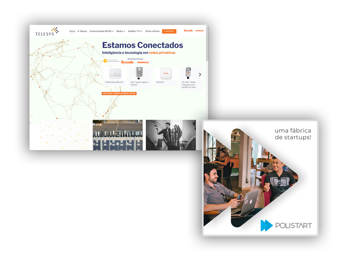
Telesys's identity went through two stages I developed at different times: first, the shift from Telesystem to Telesys, keeping elements from the parent brand. Later, I created a completely refreshed identity, moving away from the original design concept. The work also included rebranding the Hotel Tech and Poli (Start/Angels) brands, along with their respective applications. Because of this, the following projects may show different versions of the Telesys brand and its partner companies.
I currently provide design and UX consulting for Telesys's communication and event materials, contributing to the ongoing evolution of its visual identity.
Monitoring and Communication Platform
The project proposed a new digital experience to bring together security camera monitoring, audio streaming and information about the company's services into a single platform. The work involved research, information architecture, UX, UI and prototyping, with versions adapted for mobile, tablet and desktop.
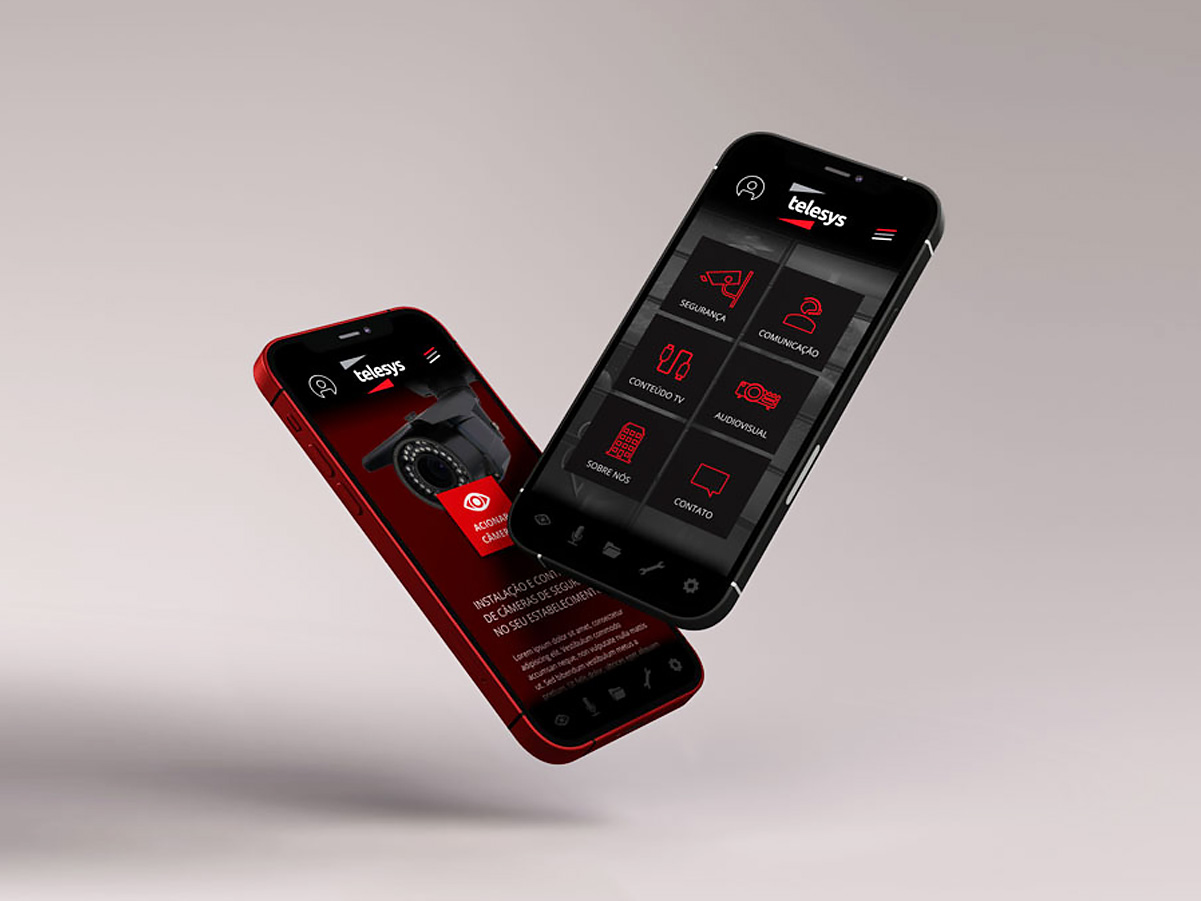
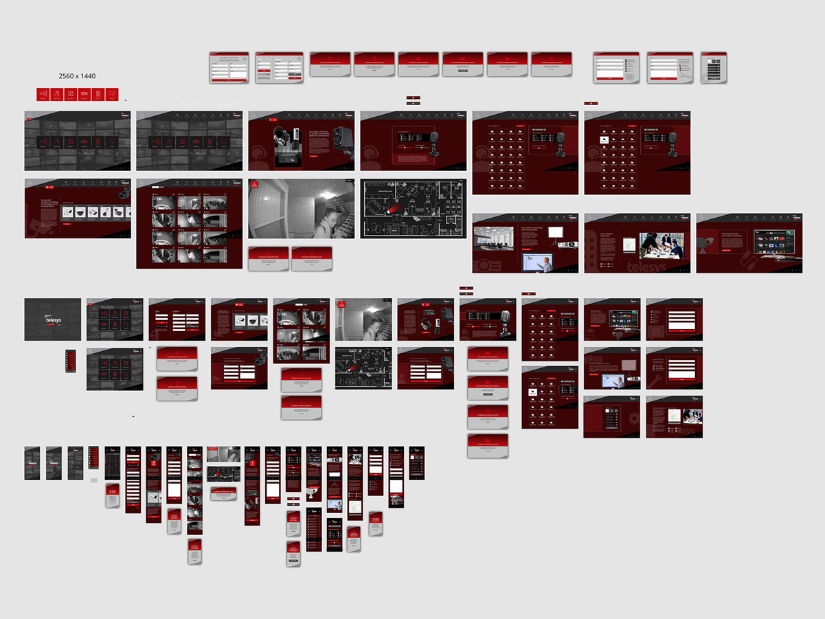
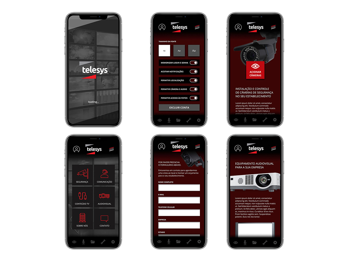
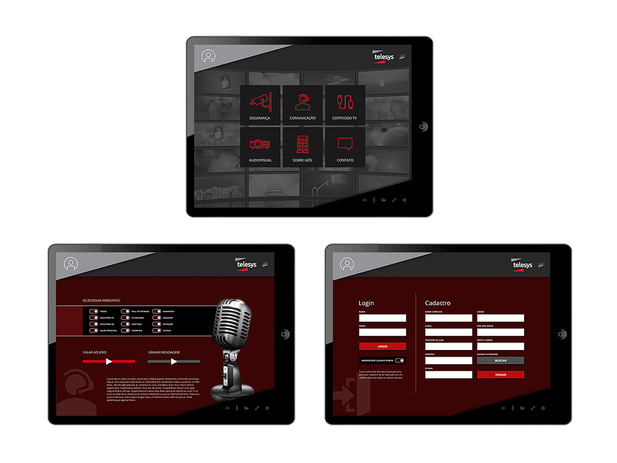
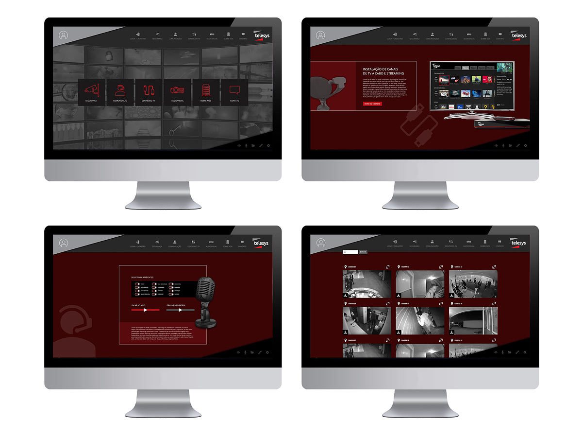
The project was developed as a conceptual prototype, with interfaces, icons and graphic elements created specifically for the solution, following Telesys's visual identity.
Product Packaging
The TS 21 was a digital terrestrial TV receiver developed by Telesys to receive digital TV signals. I developed the product's full physical packaging, defining the box's visual composition and organizing all the information required for commercial presentation, including images, product specs, accessories, codes, seals and other mandatory elements.
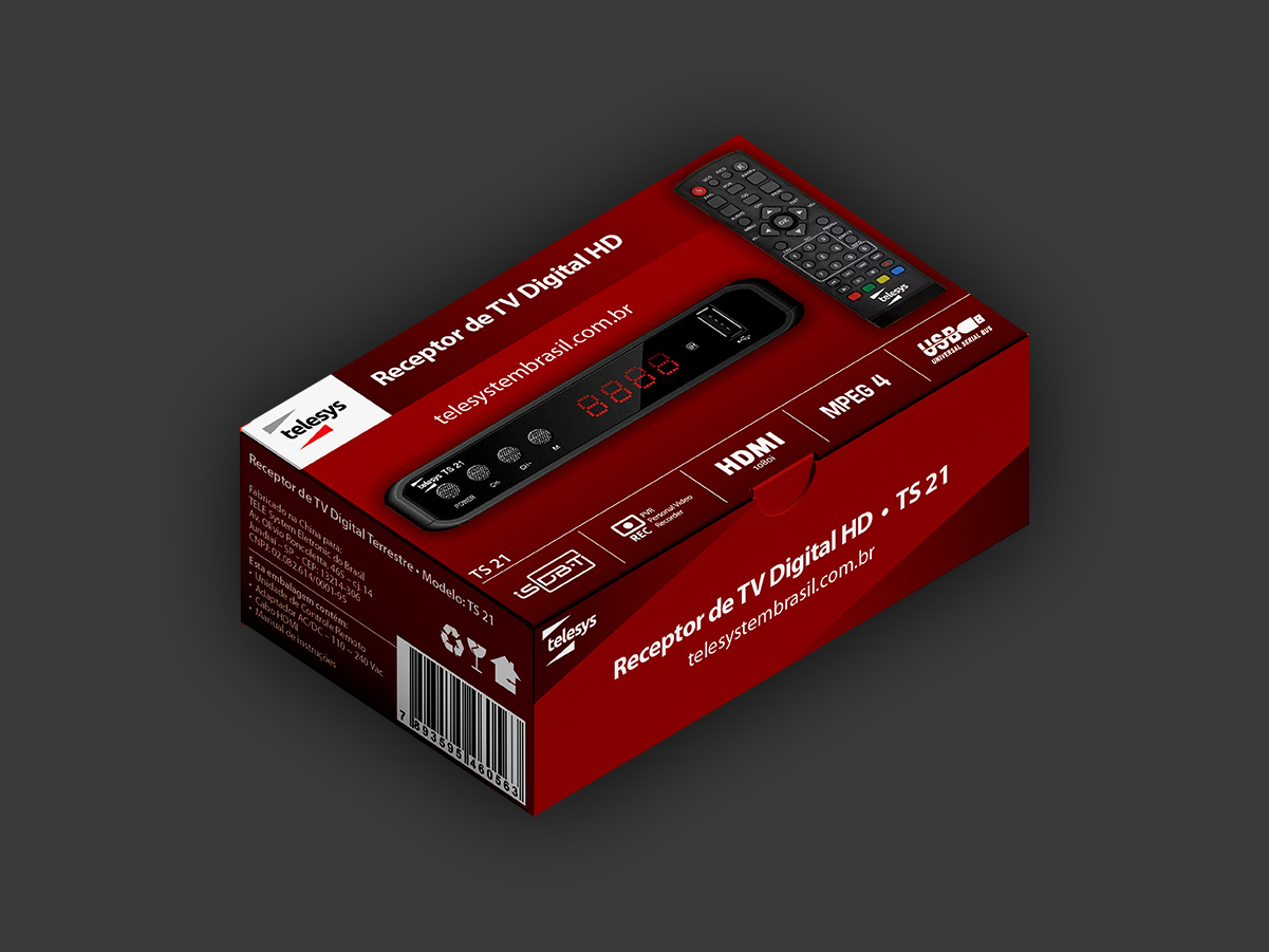
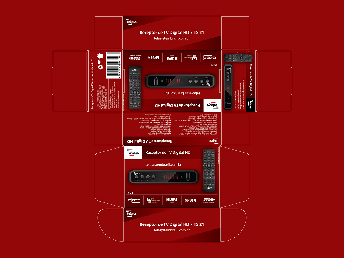
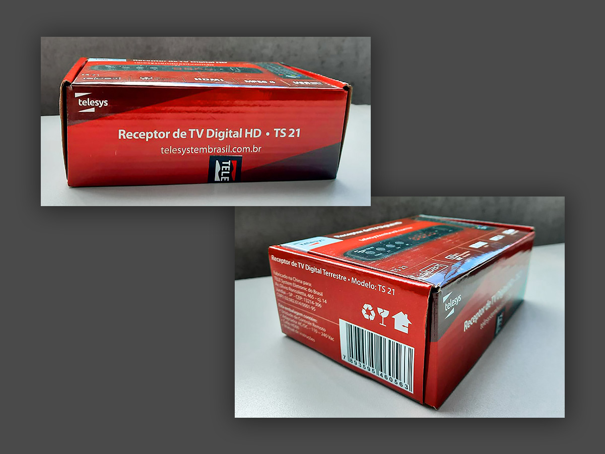
Note: this project was developed for production, with the packaging actually manufactured and used for the commercial launch of the product.
Print and Digital Campaigns
Various flyers and explainer sheets for products and services offered by the company.
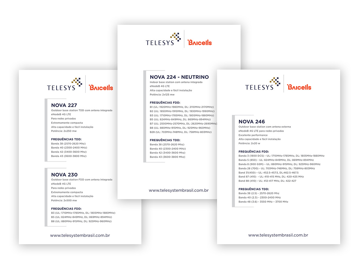
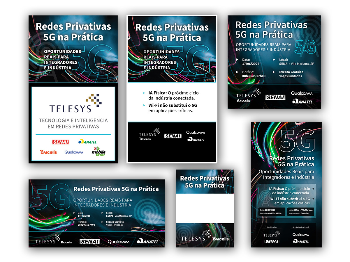
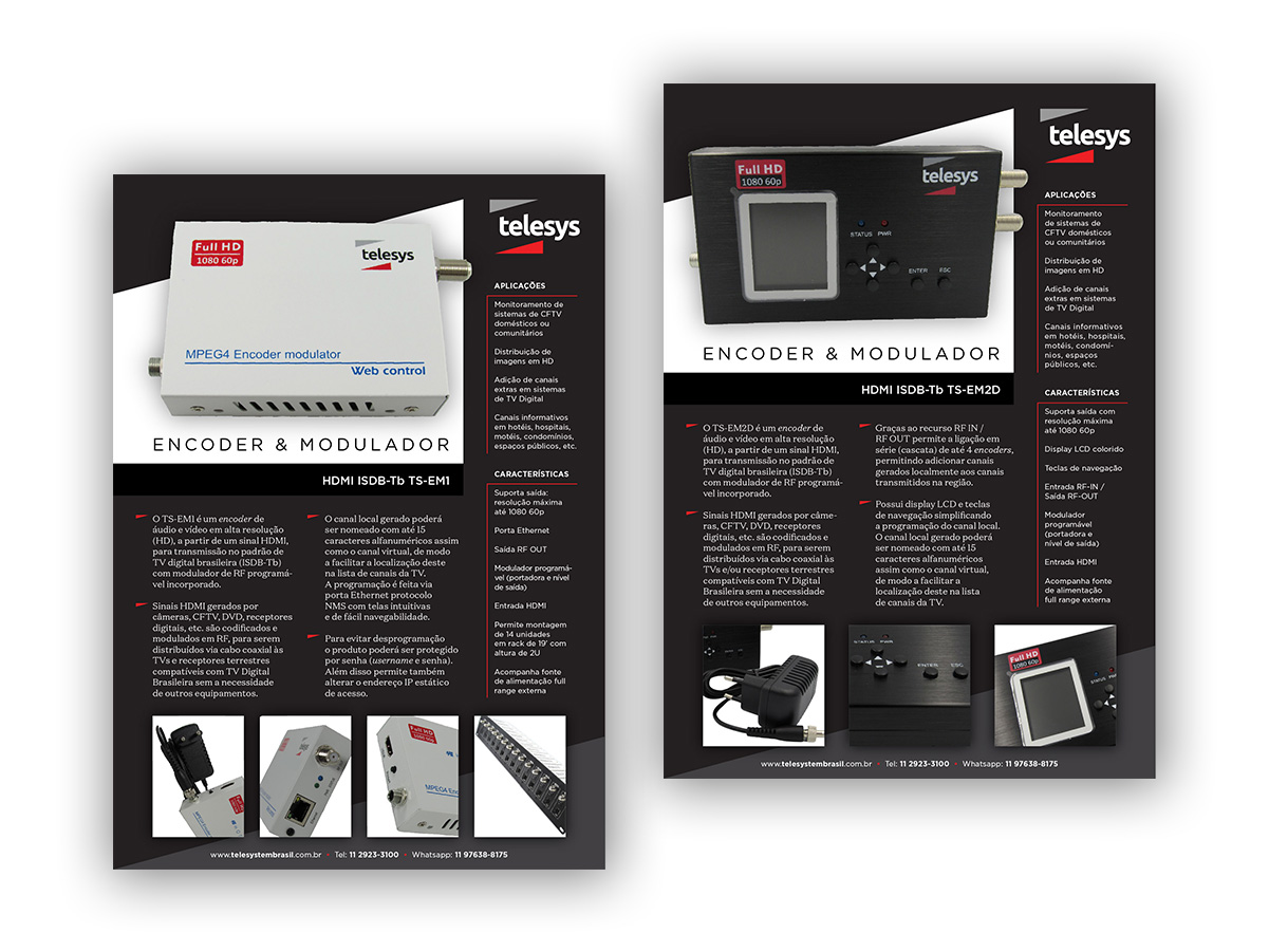
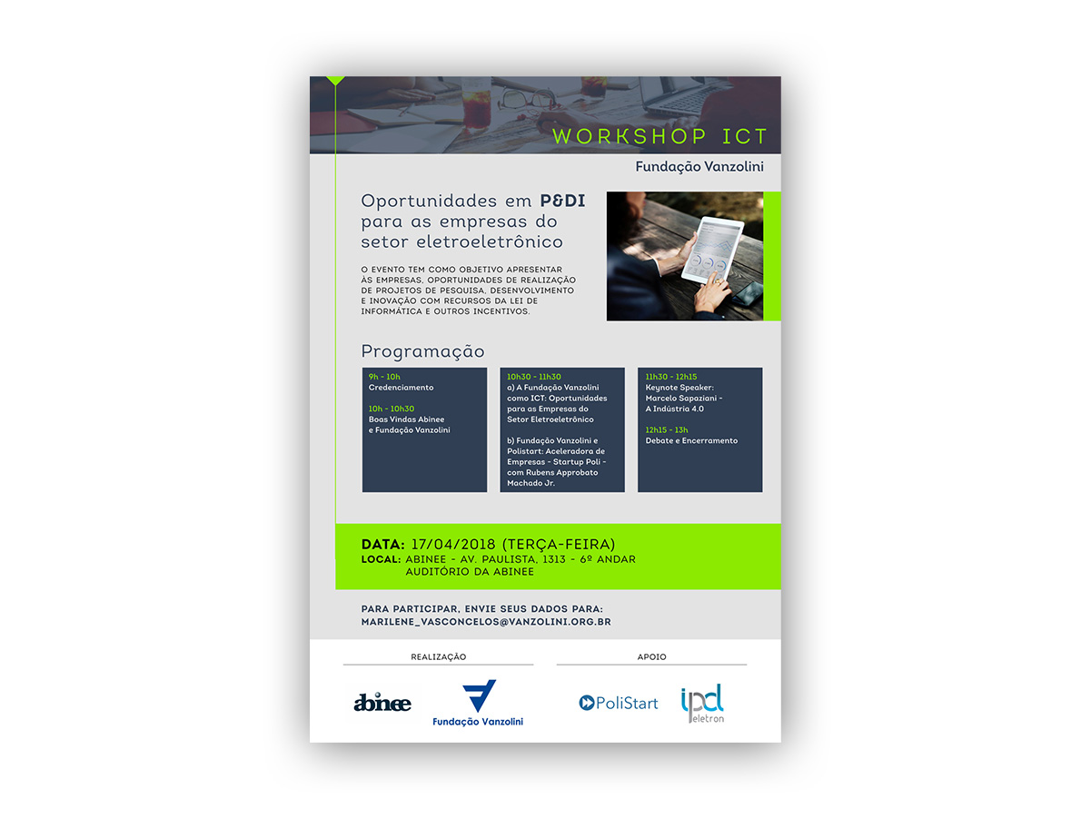
I was responsible for several “mini-projects” of corporate promotional materials for one-off events and marketing initiatives.
Visual Concept for Presentations
A recurring product for this client is corporate sales material. I receive the content “raw,” in plain text only, and from there I look for images and references to create the visual appeal for the presentation.
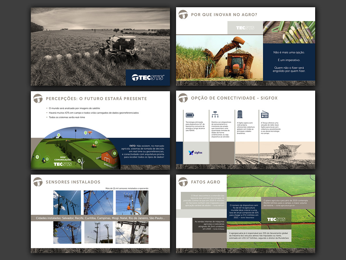
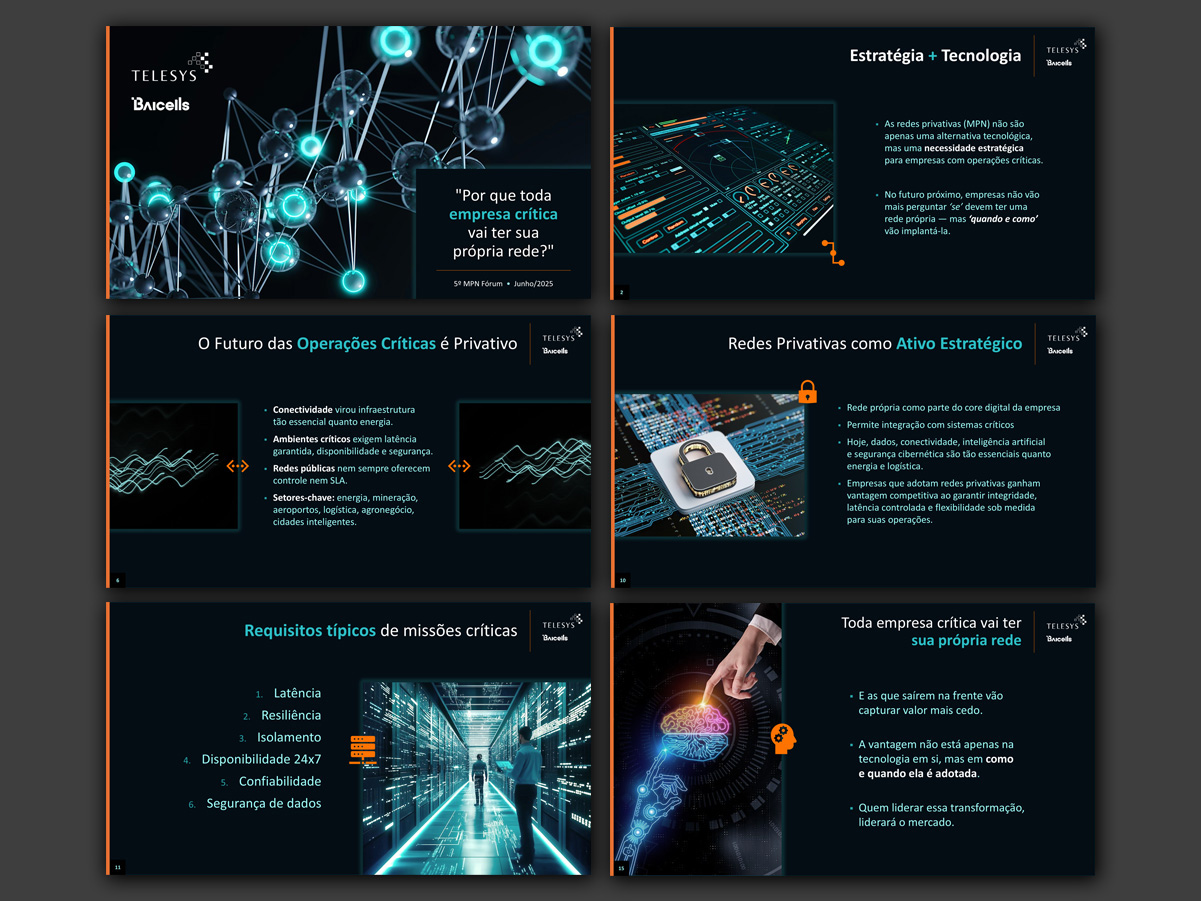
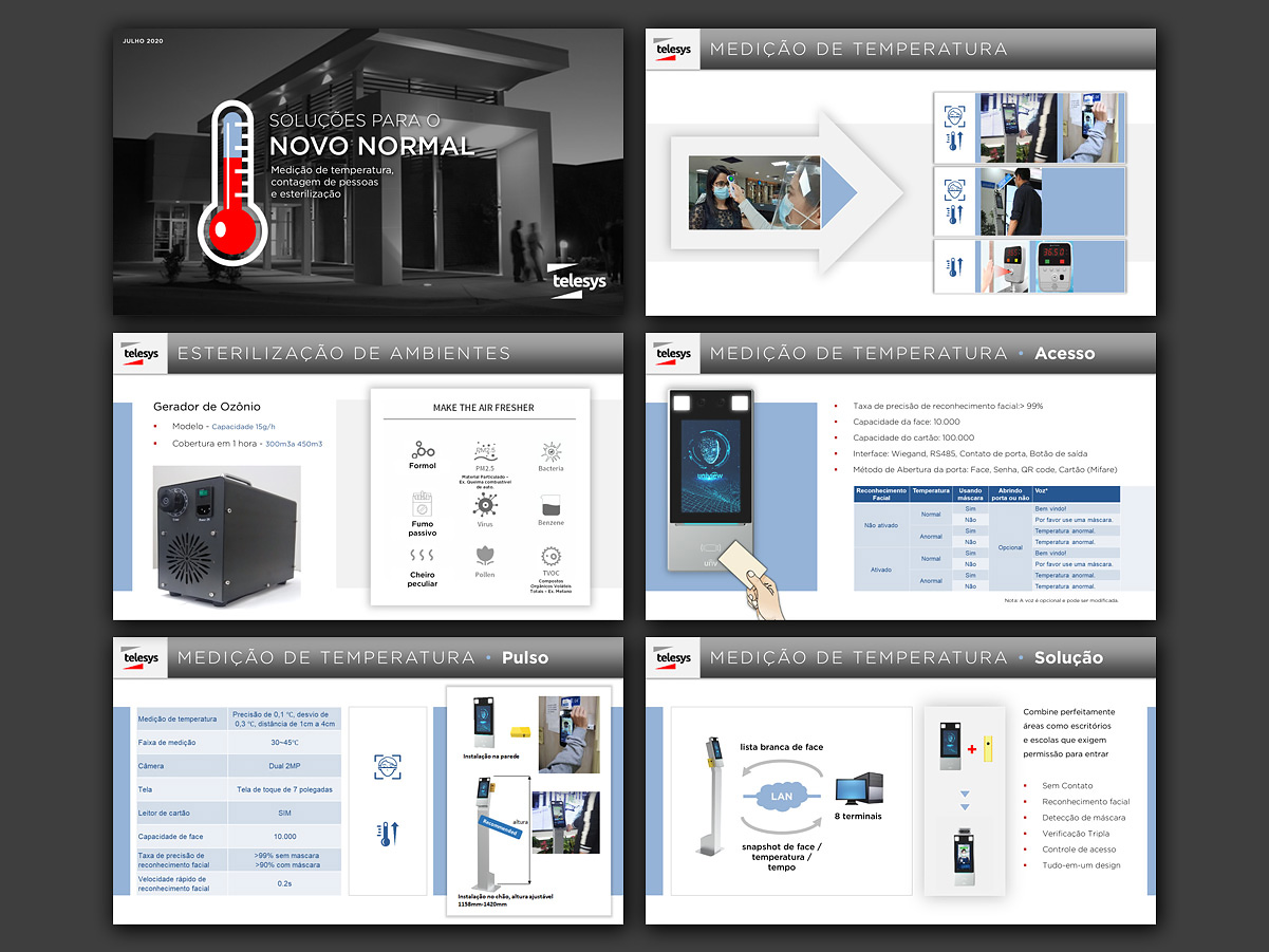
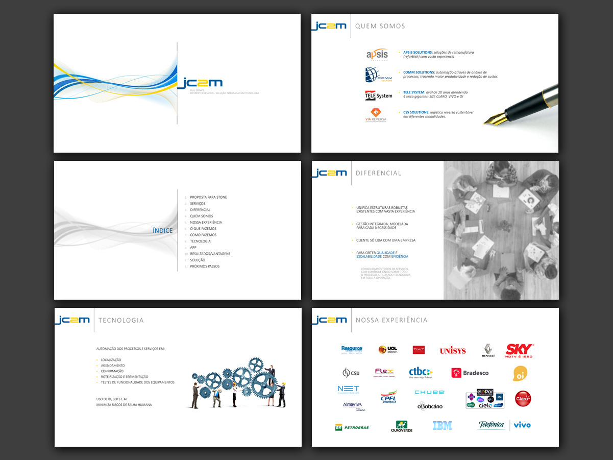
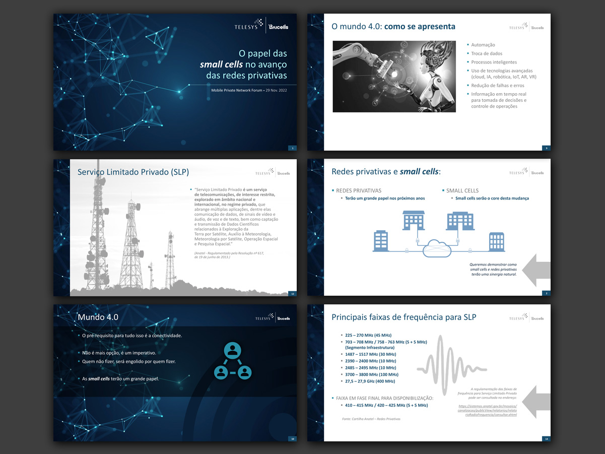
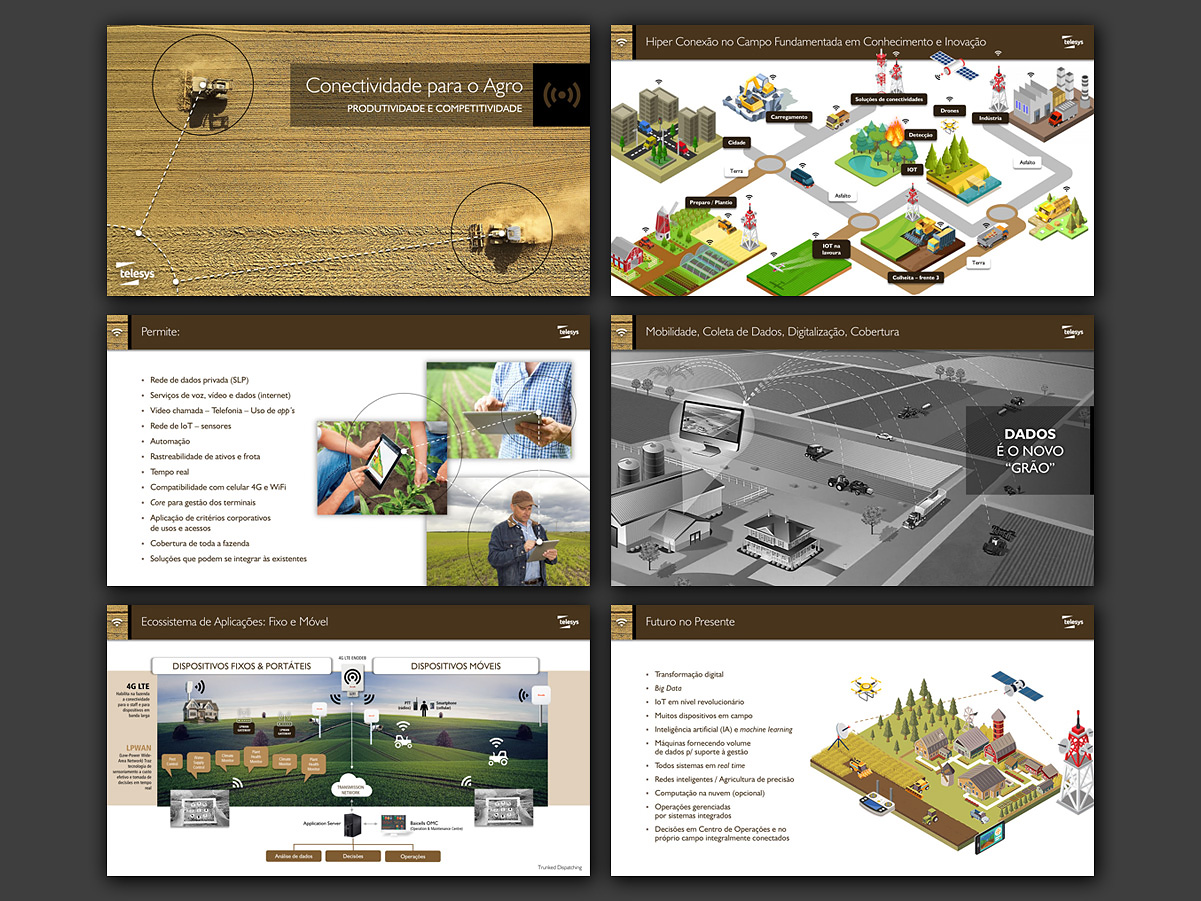
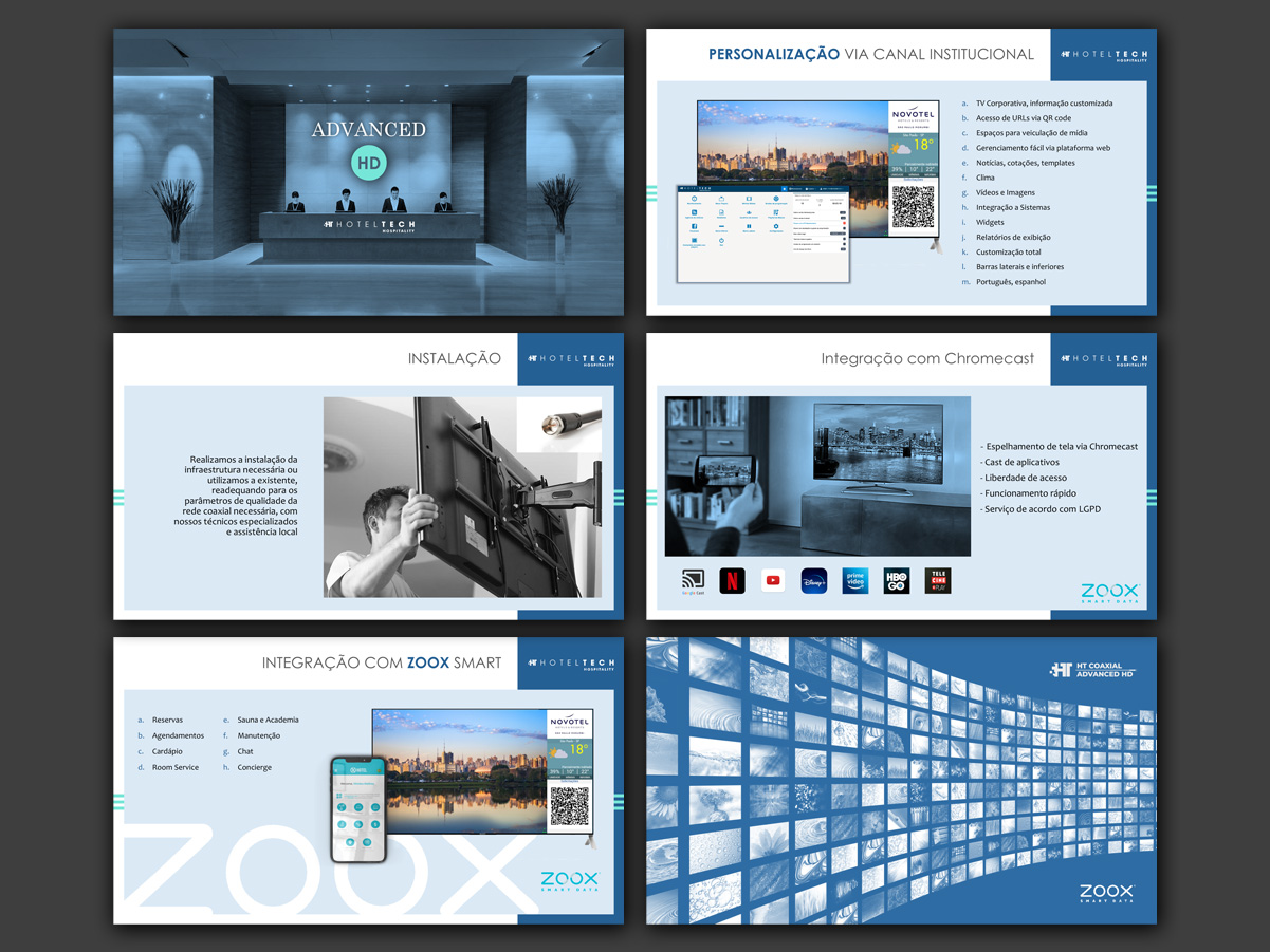
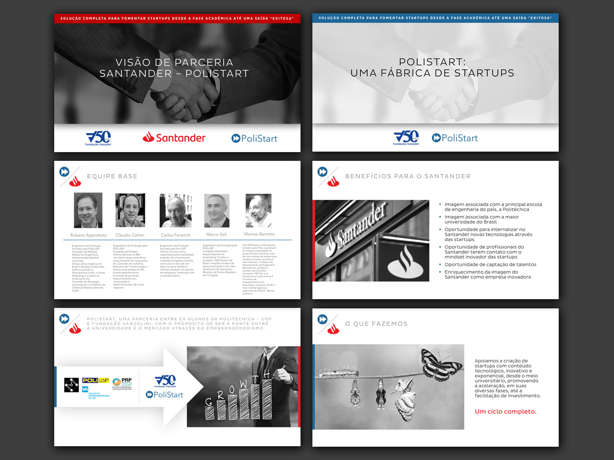
In most cases, PowerPoint was used, since the client usually needs to tweak information at the last minute. That's why the material is typically 100% editable. Above, a selection of screens from a few projects, shown out of their original order.