 |
ABOUT THE COMPANY

Brazilian investment fund for startups, focused on young entrepreneurs and innovative ideas for the national and global market.
Direct competitors: Small and medium investment funds for startups in Brazil.
Indirect competitors: Large funds, incubators, and banks.
Possible supporters: Groups of investors and fundraisers for new projects.
Other work previously produced for this same client: their entire visual identity, as well as the current website.
THE DESIGNER’S ROLE IN THE PROJECT
Proposal for updating the UX/UI of the company's website; research and usability process management; all screen creation and prototyping steps; own visual design, iconography, and graphic elements.
PROJECT GOAL
Reorganize the disclosed information on the company's website in a way that is more attractive to new investors, as well as stimulate the creation of new startups in the Brazilian market.
TARGET AUDIENCE
Investors and young entrepreneurs seeking encouragement to create their startups - as well as students interested in the financial market and the possibilities of opening their own business in the future.
KEY CHALLENGES OR CONSTRAINTS
Curiously, the biggest challenge of this project was self-overcoming. The website of this company (as well as its branding) were created by me, but after a course in UX Design, the whole concept of navigation and page design had to be revisited.
RESEARCH STUDY DETAILS
The current website visitors ask for a more compact structure that does not require so much scrolling down to see all the information. A more differentiated format was also requested for the mobile version, as the pictures ended up being too big and tiresome.
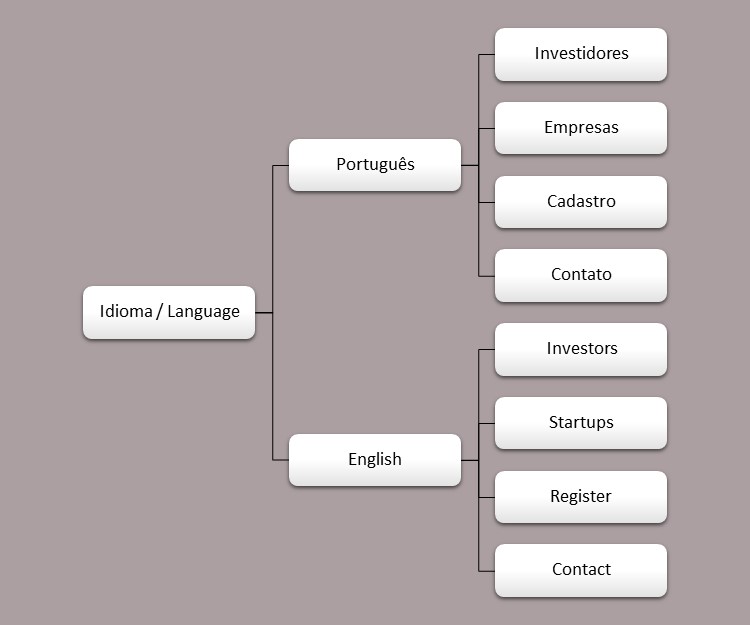
| PERSONAS |
The company's focus is very clear and defined - to bridge the gap between investors and startups - so the end user is undoubtedly these two profiles - the investor and the startup. It was difficult to define which platform is most used by the users, because the use of computer, cell phone and even tablet was well divided. Therefore, we studied the screens for all three formats. In relation to the general profile of the user, they would be adults who work (or invest), mainly between 30 and 60 years old - in relation to investors, the majority is male, but in startups, many female entrepreneurs are emerging in the market.
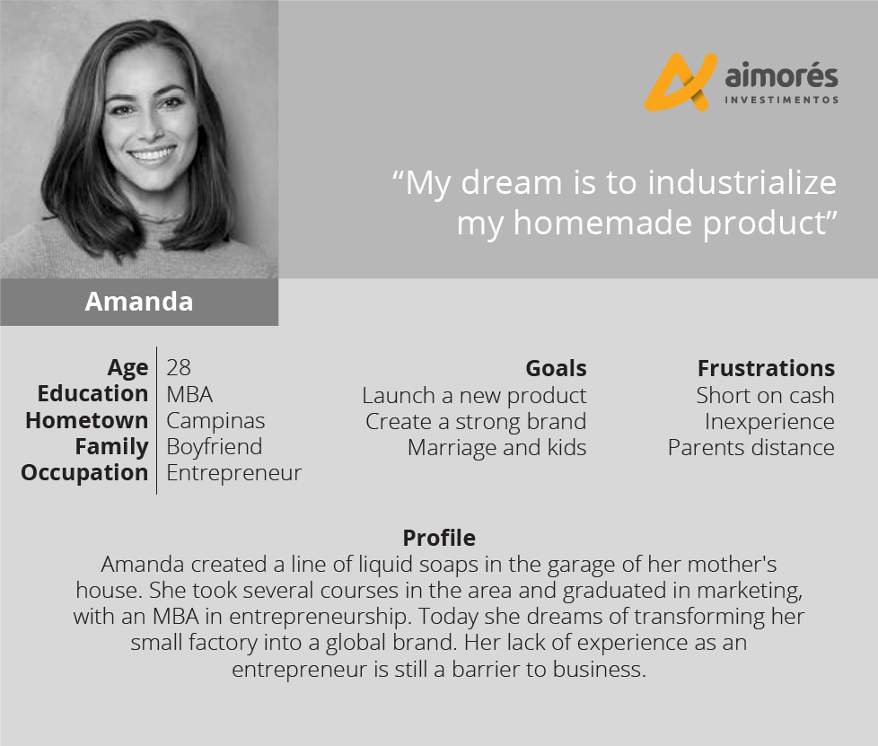
User Story (entrepreneur): "As an entrepreneur, I need INVESTMENT so that I can INDUSTRIALIZE MY PRODUCT".
Problem Statement (entrepreneur): "Amanda, who is a young entrepreneur, seeks investors so she can grow her company and create a global brand".
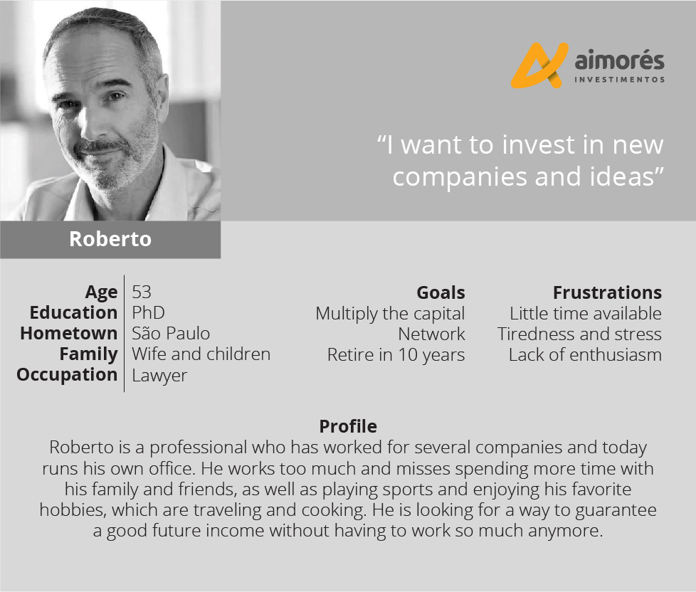
User Story (investor): "As an INVESTOR, I want to FIND NEW OPPORTUNITIES, so that then MY INCOME WILL INCREASE".
Problem Statement (investor): "Roberto, who is an investor in the city of São Paulo, is looking for a fund that offers new stock options in startups, so he can multiply his assets".
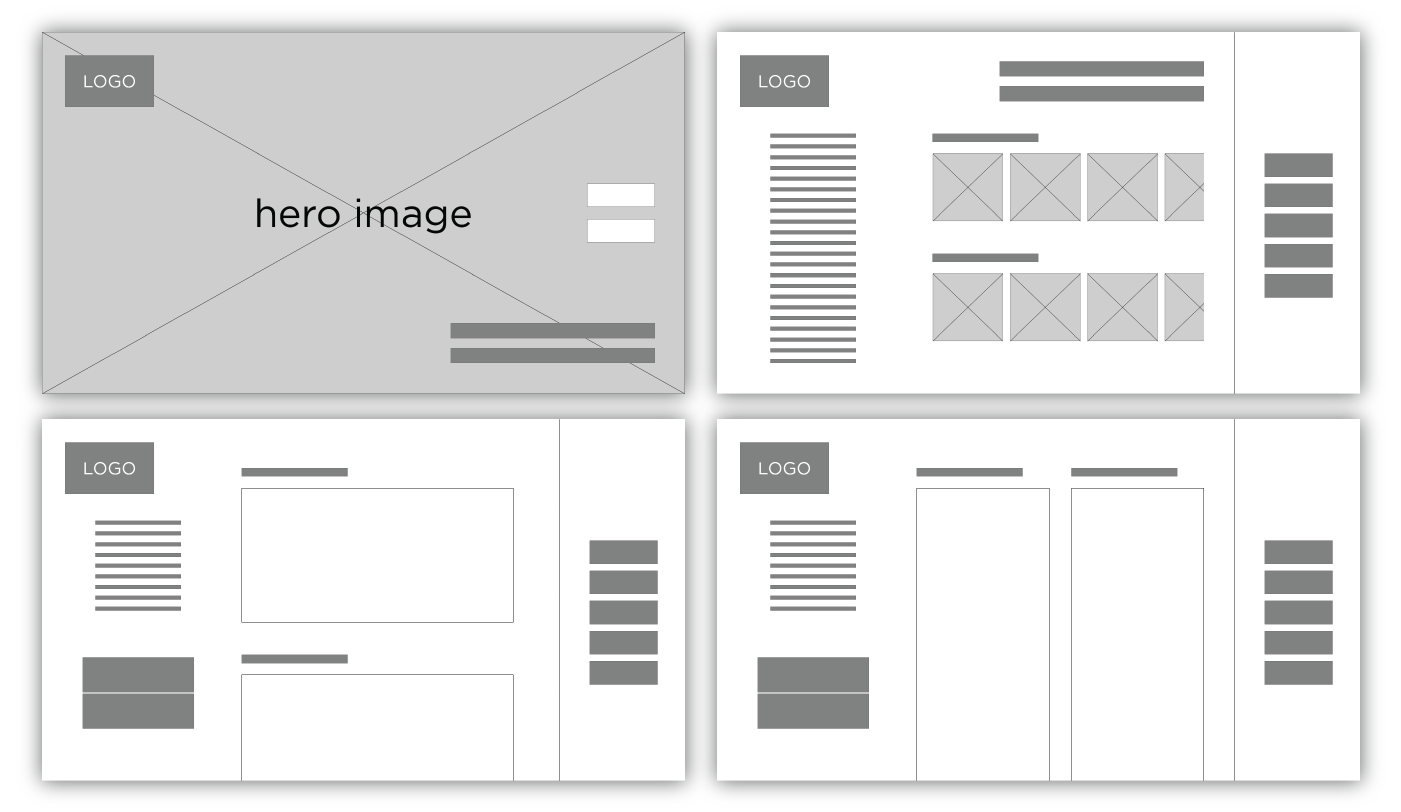
| INITIAL DESIGN CONCEPTS |
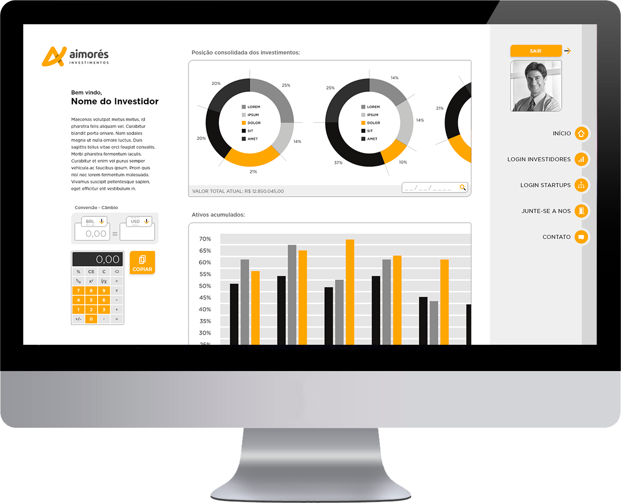
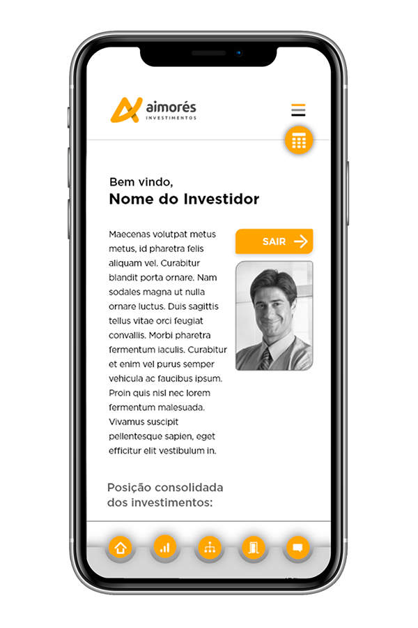
This project requires large screens because of the amount of information in charts and tables (investment funds, company data, etc.), so the first conception was for the desktop, then shrinking for the tablet and then the mobile (graceful degradation).
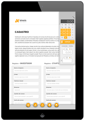
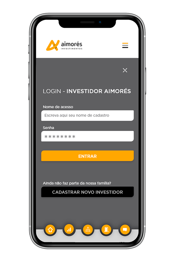
Besides the main menu, it was thought to offer some quick tools like a calculator and a currency converter.
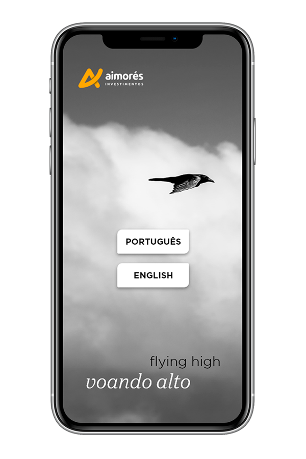
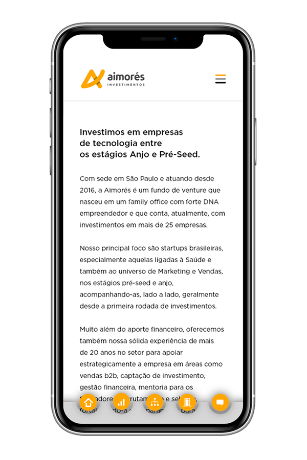
The use of photos was very limited so as not to put too much visual information together. The graphic concept was as clean as possible, with as much white space for breathing.
| USER INTERFACE AND PROTOTYPE |
Used software: Adobe XD, Illustrator and Photoshop + Microsoft Office.
All screens and pop-ups:
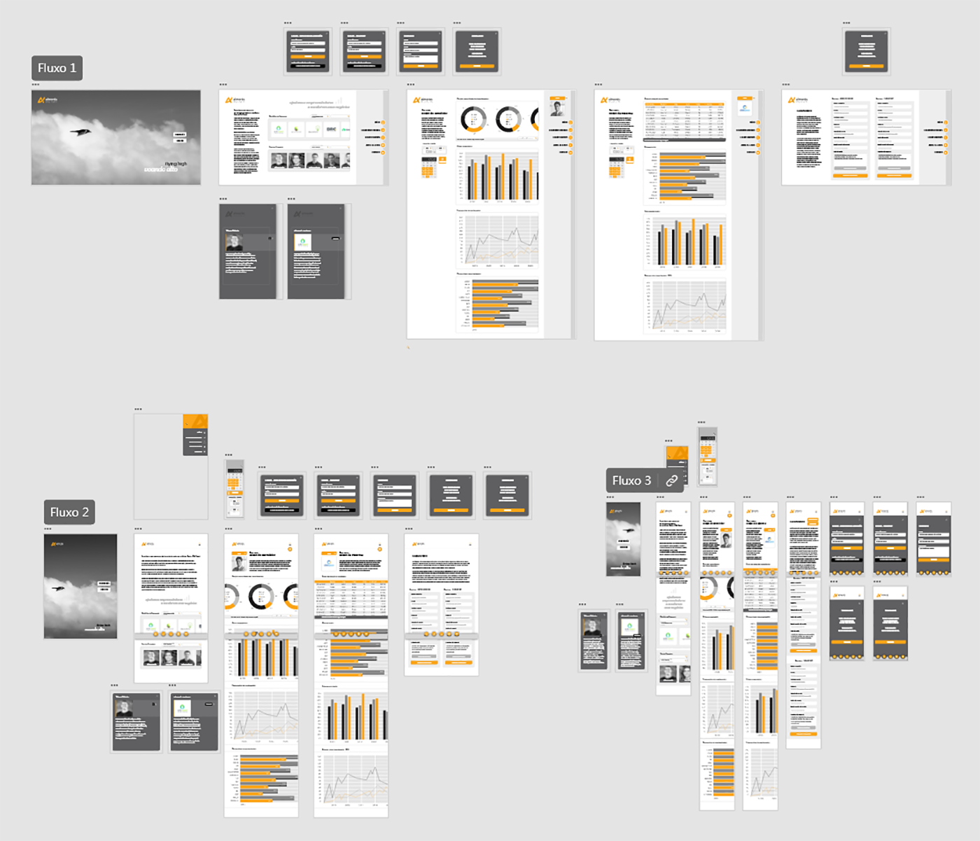
Prototype simulation:
DESKTOP VERSION:
Watch the video on Youtube: LINK
Control yourself the navigation of this prototype, in XD: LINK
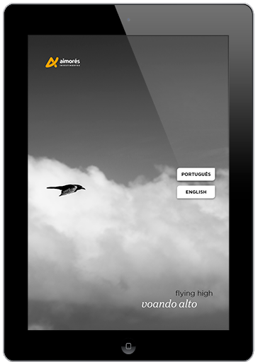
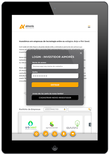
TABLET VERSION:
Watch the video on Youtube: LINK
Control yourself the navigation of this prototype, in XD: LINK
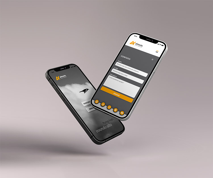
MOBILE VERSION:
Watch the video on Youtube: LINK
Control yourself the navigation of this prototype, in XD: LINK
Custom icons, colors and images for this project:
![]()
![]()
| USER TESTING RESULTS AND CONCLUDING REMARKS |
DESIGNER'S REVIEW
This experience was very eye-opening, as I had the chance to work over a product that I had initially created myself. It's really interesting how we can entirely redo a proposal, fixing our own flaws and improving the usability so much.
The chance of redesigning the layouts for 3 formats was very enriching! Although there are still some adjustments to be made, especially in the size of the graphics and tables (they are too big), it was possible to get a good idea of the whole process of resizing.
USERS' REVIEWS
There is one crucial point (P0) that needs to be reviewed: when scrolling down the table on tablet and mobile, it locks the scrolling of the entire page, i.e. to go down to the next item, you have to finish the entire table (and the same happens when scrolling back up).
There has been much improvement in the organization of the sections and the side-scrolling of the galleries. There is still room for refinement in some alignments, proportions, and positioning.
UP NEXT
Actually the current company website was made by me, including the coding and creation of the html pages - i.e. there was no separation of UI and development - surely a next version will have much more freedom of creation, due to passing the structure to a software engineer.
Remembering that the company's entire visual identity is also of my own authorship, which already creates a special bond with the following projects.
rogerweikers.com - 2026 Copyright ©
Home | Overview | Aimores | Telesys | Sindilub | Petrol | Magik JC | RW Gallery | Studio | Contact | Top