 |
ABOUT THE COMPANY

São Paulo's interstate trade union for automotive lubricants - a business partner of several major brands in the oil industry, as well as smaller scale retailers and dealers.
Direct competitors: Unions and organizations of the same niche in neighboring areas or of national impact.
Indirect competitors: Unions and organizations in similar areas, such as oil companies, automotive, etc.
Possible supporters: They are precisely their target audience - the producers and retailers of automotive lubricants in Brazil, who advertise in their publications and support their major networking events.
Other work previously produced for this same client: brand redesign; bimonthly printed magazine; website design; creation and management of posts for social networks; corporate event signage and communication materials design.
THE DESIGNER’S ROLE IN THE PROJECT
Overall project conception, as well as research and usability process management; all screen creation and prototyping steps; own visual design, iconography, and graphic elements.
PROJECT GOAL
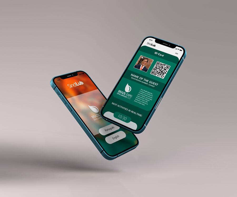
Make it easier to register and join a specific event, organized and offered by the union. Through this app, the guest, speaker, exhibitor and staff can make different login and access in real time the information of the venue and the schedule.
TARGET AUDIENCE
Focusing mainly on the male gender that practically controls the automotive market - people interested in learning more about lubricants, their manufacturers, and retailers.
Overall project conception, as well as research and usability process management; all screen creation and prototyping steps; own visual design, iconography, and graphic elements.
PROJECT GOAL
Make it easier to register and join a specific event, organized and offered by the union. Through this app, the guest, speaker, exhibitor and staff can make different login and access in real time the information of the venue and the schedule.
TARGET AUDIENCE
Focusing mainly on the male gender that practically controls the automotive market - people interested in learning more about lubricants, their manufacturers, and retailers.
KEY CHALLENGES OR CONSTRAINTS
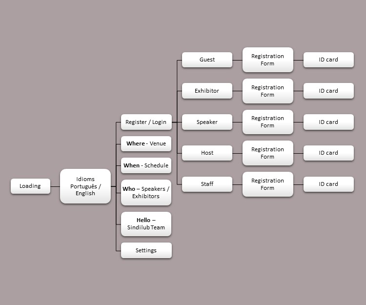
This project initially presents a prototype of 5 apps in one. In the future, each type of participant will have access to different information. For example, Sindilub members (hosts) will be able to control all attendees in real time. Speakers will be notified about the times of their presentations, and so on. In other words, the product is actually the foundation structure that can (and should) bring many other features and benefits.
RESEARCH STUDY DETAILS
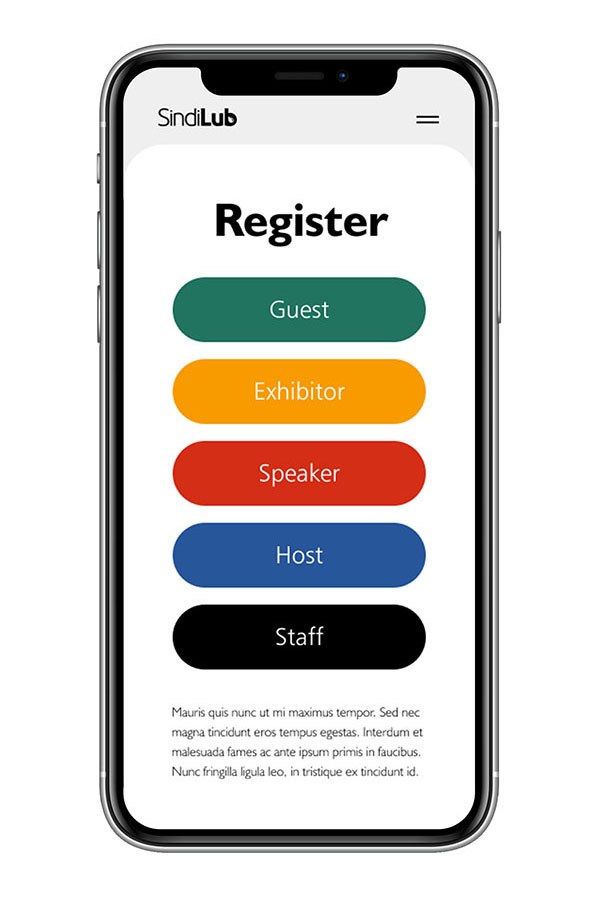
The event planners asked for clarity and objectivity when seeing (even from a distance) which category the participant belongs to. For this, it was suggested a strong and visible color differentiation, so that when the person opens their app (when arriving at the entrance reception, for example), the concierge automatically identifies which group that guest is part of.
This project initially presents a prototype of 5 apps in one. In the future, each type of participant will have access to different information. For example, Sindilub members (hosts) will be able to control all attendees in real time. Speakers will be notified about the times of their presentations, and so on. In other words, the product is actually the foundation structure that can (and should) bring many other features and benefits.
RESEARCH STUDY DETAILS
The event planners asked for clarity and objectivity when seeing (even from a distance) which category the participant belongs to. For this, it was suggested a strong and visible color differentiation, so that when the person opens their app (when arriving at the entrance reception, for example), the concierge automatically identifies which group that guest is part of.
| PERSONAS |
This app was designed targeting the participants that will both visit and work at the event. The event usually takes place every year in a large conference center and hotel in Campinas (state of São Paulo, Brazil). At the main lectures the public exceeds two thousand people, who also stroll around the fair's stands, where several exhibitors show their products. So the end user of the tool is: 1) the guest who registers and pays for the activities, meals and lodging; 2) the lecturers who are Sindilub's guests; 3) the exhibitors who participate in the fair's hall; 4) the party's hosts; 5) staff hired to organize the event, security services, catering, reception, cleaning, etc.
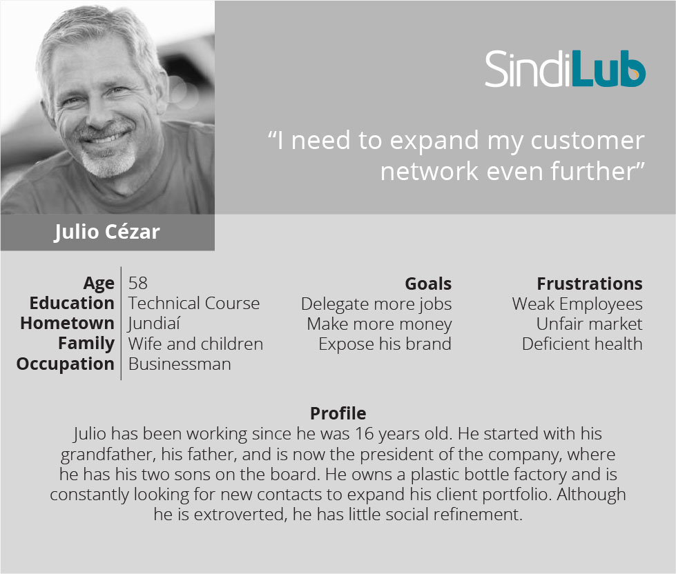
User Story (entrepreneur): "As an OWNER OF A BOTTLE FACTORY, I need a PRACTICAL APP, so that I can SIGN UP EASILY FOR THE SINDILUB EVENT".
Problem Statement (entrepreneur): "Julio Cézar, who is a senior entrepreneur, is looking for an easy-to-use tool, so he can quickly understand the mechanics and intuitively operate everything by himself".
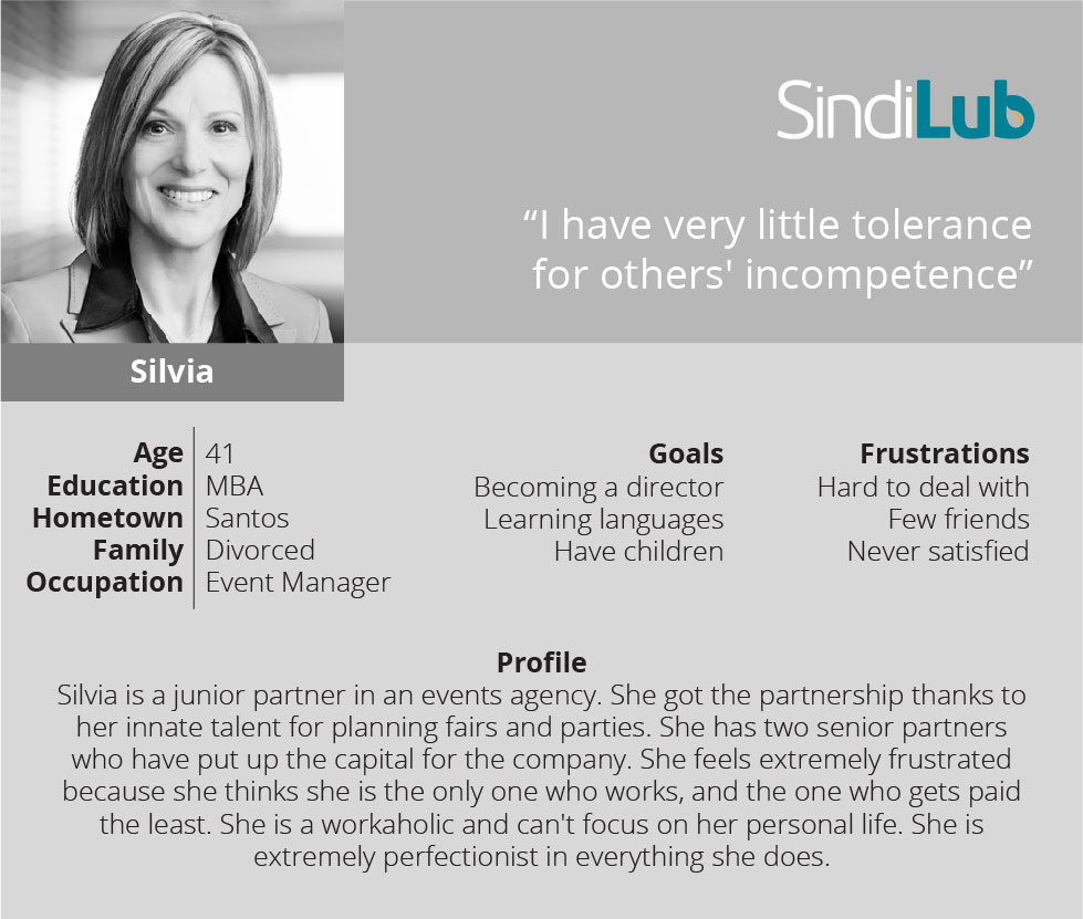
User Story (event planner): "As an EVENT AGENCY, I want an APP THAT MAKES IT EASIER for all my staff to be MANAGED IN REAL TIME".
Problem Statement (event planner): "Silvia, who is an outsourced event manager, is looking for a tool that is quick and easy to access, so that she can organize all the steps of setting up and running a conference".
| INITIAL DESIGN CONCEPTS |
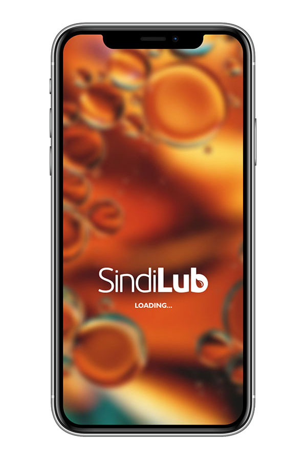
This product will be designed only for the mobile version, since it is assumed that 100% of the participants will carry their devices with them, throughout the event. The main focus of the visual concept is practicality. Due to the fact that this is an audience who does not work directly with IT (the vast majority are dealers or producers of lubricants or automotive accessories), the language needs to be very obvious, quick and easy to handle.
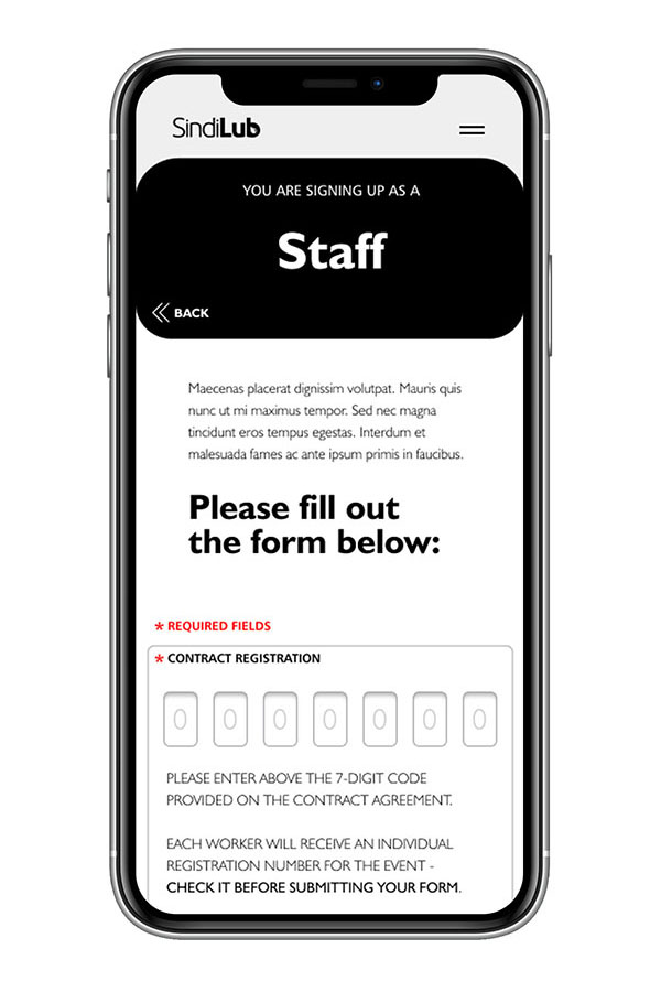
A five-color palette was created to immediately differentiate the category of the participant. Because of this, the basic look of the site is black and white, allowing the color area for such identification. Black also functions as one of the five colors (for staff), this is because of the standard uniforms these workers will wear.
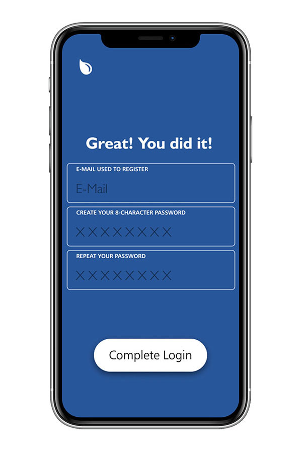
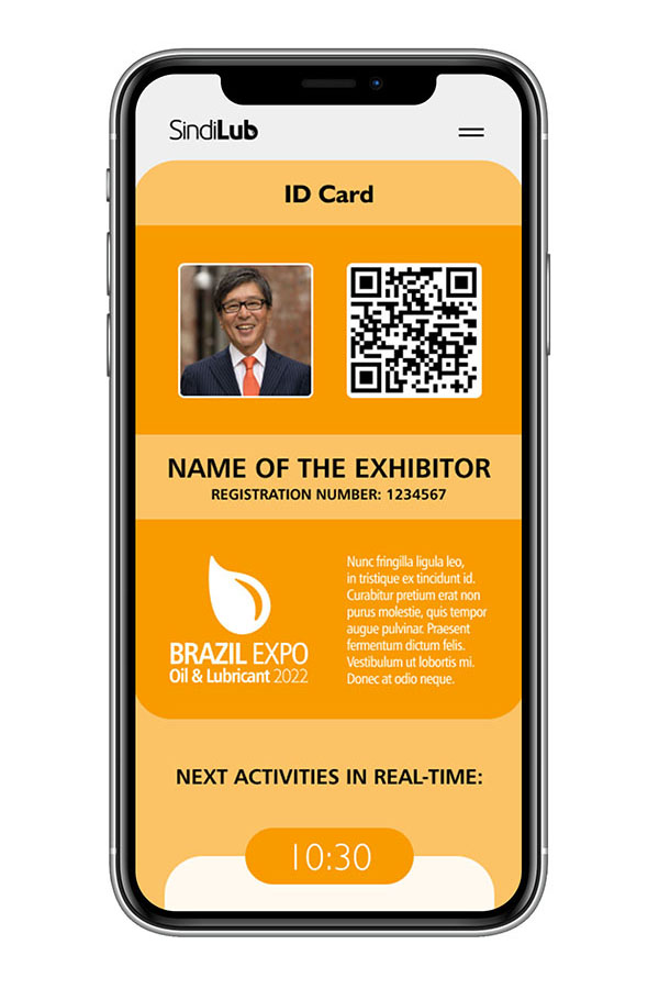
The menu comes only at the top, so as not to confuse the older audience (who are less used to apps). So the footer bar has been dropped. The participant ID design will work as an entrance passport, where the QR code reader will directly transmit to the receivers all the registration information of that person.
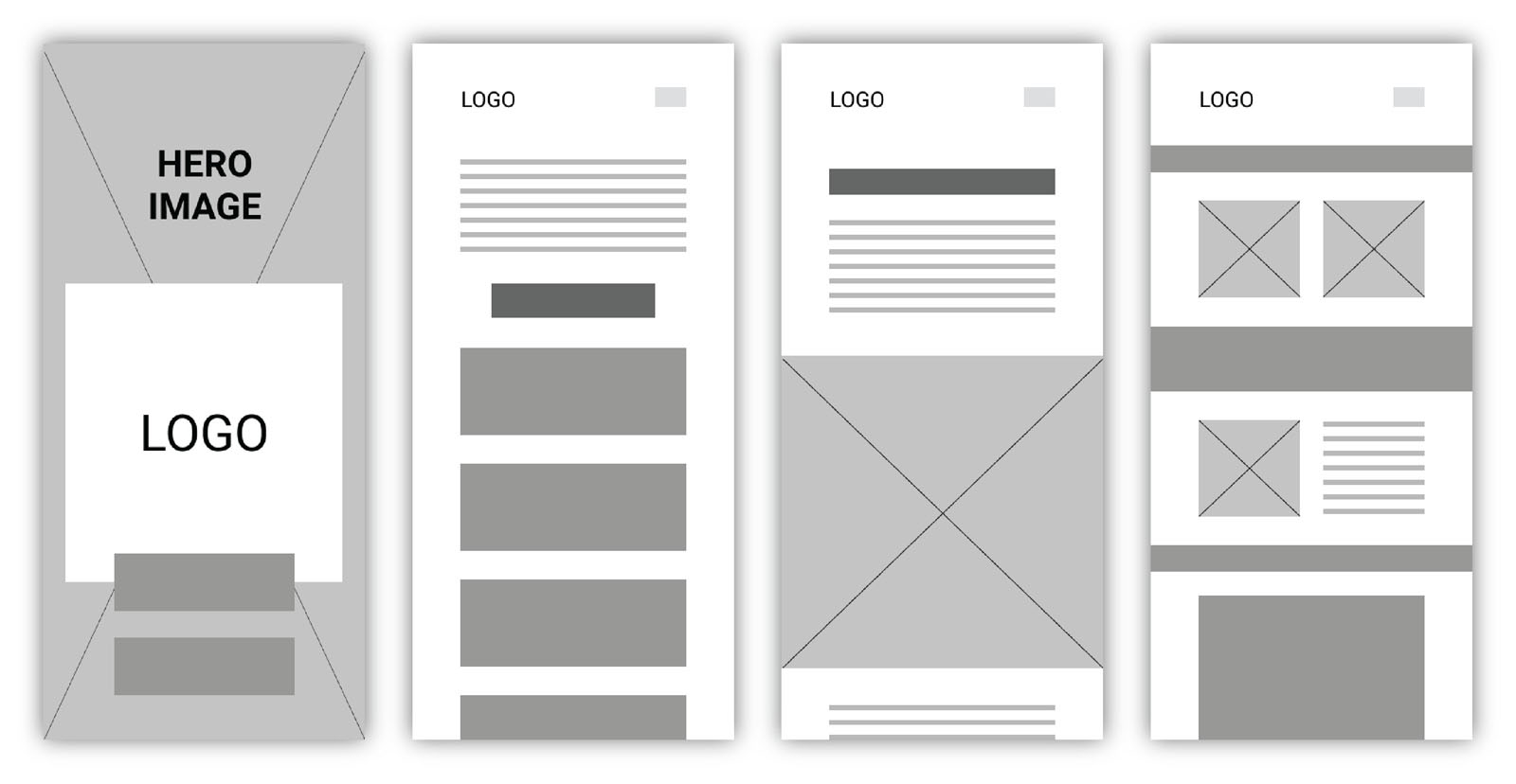
| USER INTERFACE AND PROTOTYPE |
Used software: Figma + Adobe Illustrator and Photoshop + Microsoft Office.
All screens and pop-ups:
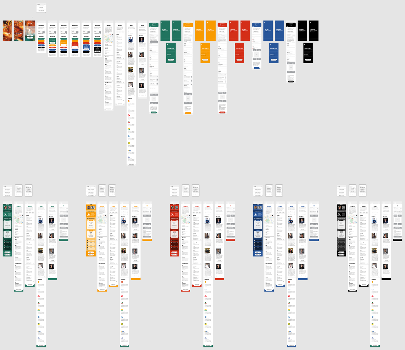
Prototype simulation:
Watch the video on Youtube: LINK
Control yourself the navigation of this prototype, in Figma: LINK
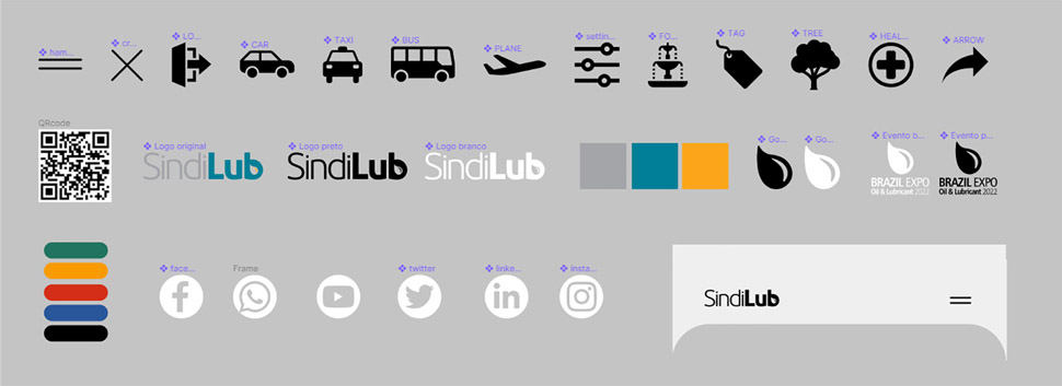
Custom icons, colors and images for this project:
![]()
| USER TESTING RESULTS AND CONCLUDING REMARKS |
DESIGNER'S REVIEW
I believe this platform is an excellent embryo for future projects. The concept is easily adaptable for any client and event involved.
Regarding the UI of the product, I was very happy with the result as it is extremely clean, simple and straightforward. As I have been working for this client for many years, I would already know practically all their remarks and preferences in advance.
USERS' REVIEWS
Several users asked for an area to insert their opinions and comments about the presented themes, as if it were an open chat for all participants. It was also suggested a fast localization service inside the conference, via GPS.
There was a complaint about the color palette, which does not match the Sindilub branding. It was requested a version using the logo petroleum blue instead of the current one, and for that, the green would also need to be changed to avoid confusion. (this detail was actually seen before the creation and it was decided to change the original palette because of this confusion between blue and green)
UP NEXT
Much remains to be done. The base is well structured, but each of the 5 platforms will have different features. I even see it as a product in constant evolution and adaptation for the following events.
It will be important to make a connection between this app and the company's institutional site. Not only the download link, but also a mirroring of all the event information, placed in the web version.
rogerweikers.com - 2026 Copyright ©
Home | Overview | Aimores | Telesys | Sindilub | Petrol | Magik JC | RW Gallery | Studio | Contact | Top