 |
ABOUT THE COMPANY

Building construction company in the city of São Paulo, focused on modern and compact real estate for the lower middle class, taking advantage of simple and not luxurious neighborhoods that are being revitalized.
Direct competitors: construction companies for the middle class in and around downtown São Paulo.
Indirect competitors: real estate search apps and also luxury construction companies that operate in the same region.
Possible supporters: NGOs and groups focused on revitalizing urban areas and setting up parks and gardens, as well as interior designers and the furniture and decoration industry.
Other work previously produced for this same client: interface design for corporate presentations.
THE DESIGNER’S ROLE IN THE PROJECT
Adaptation of an existing company project to the app format; re-branding; research and usability process management; all screen creation and prototyping steps; own visual design, iconography, and graphic elements.
PROJECT GOAL
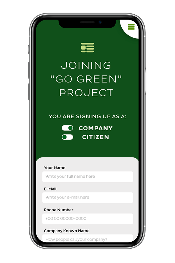
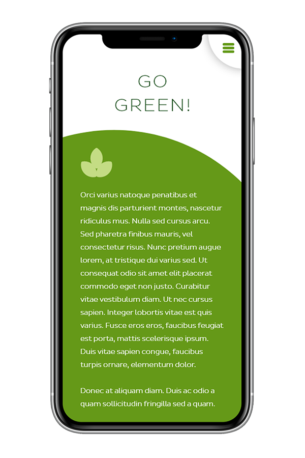
Spread the idea of making cities greener, and through this app, the client who looks for an apartment from the company, will have the opportunity to collaborate with the planting of trees and gardening of flowerbeds and parks in the neighborhood.
TARGET AUDIENCE
Current clients and potential buyers of the properties offered by the company, as well as people interested in making cities greener. Profile of its current customers: middle-class young adult group.
Adaptation of an existing company project to the app format; re-branding; research and usability process management; all screen creation and prototyping steps; own visual design, iconography, and graphic elements.
PROJECT GOAL
Spread the idea of making cities greener, and through this app, the client who looks for an apartment from the company, will have the opportunity to collaborate with the planting of trees and gardening of flowerbeds and parks in the neighborhood.
TARGET AUDIENCE
Current clients and potential buyers of the properties offered by the company, as well as people interested in making cities greener. Profile of its current customers: middle-class young adult group.
KEY CHALLENGES OR CONSTRAINTS
Bringing lightness and the concept of "green city" to an app about buildings and civil construction - the biggest challenge in this case, was to break the barrier of prejudice that people have with a concrete jungle, and visually conquer them by the parks and vegetation concept.
RESEARCH STUDY DETAILS
Several people interested in buying real estate were interviewed, as well as some realtors in the field. There was a unanimous request for large and good quality photos of the buildings and unit interiors, as well as the common areas of the building and if possible, the surroundings. There were also comments about the clarity of the information and the need for simple navigation to migrate to the program for planting trees and gardens.
| PERSONAS |
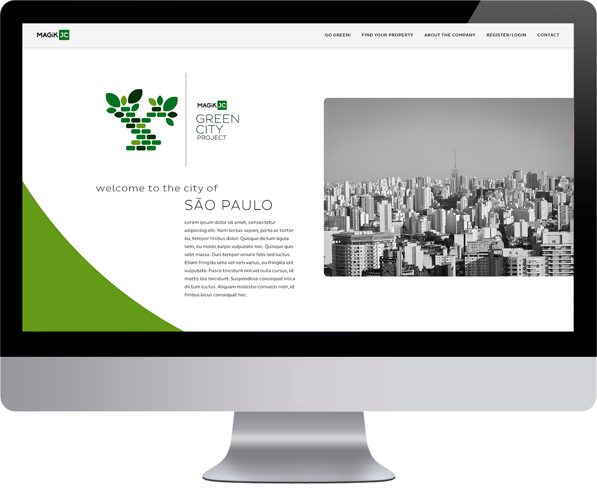
This project is a campaign for the beautification of downtown São Paulo, organized by the construction company Magik JC - its brand was restyled just for this visual identity, as well as the tree's logo (both created by me). The focus of users, at first, are lovers of the city, nature and the environment in general - but naturally, the company wants to link this service to its products - the real estate! So the end user can be a person who wants to collaborate with the parks and flowerbeds, as well as a potential client for an apartment.
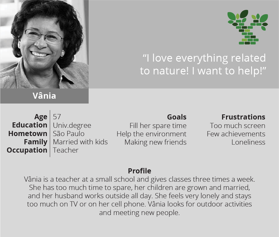
User Story (volunteer): "As a TEACHER, I am looking for OUTDOOR ACTIVITIES IN NATURE, so that I can DISTRICT MYSELF, COLLABORATE WITH THE CITY AND MAKE NEW FRIENDS".
Problem Statement (volunteer): "Vânia, who is a course teacher, is looking for new outdoor activities, so that she can volunteer and make new friends".
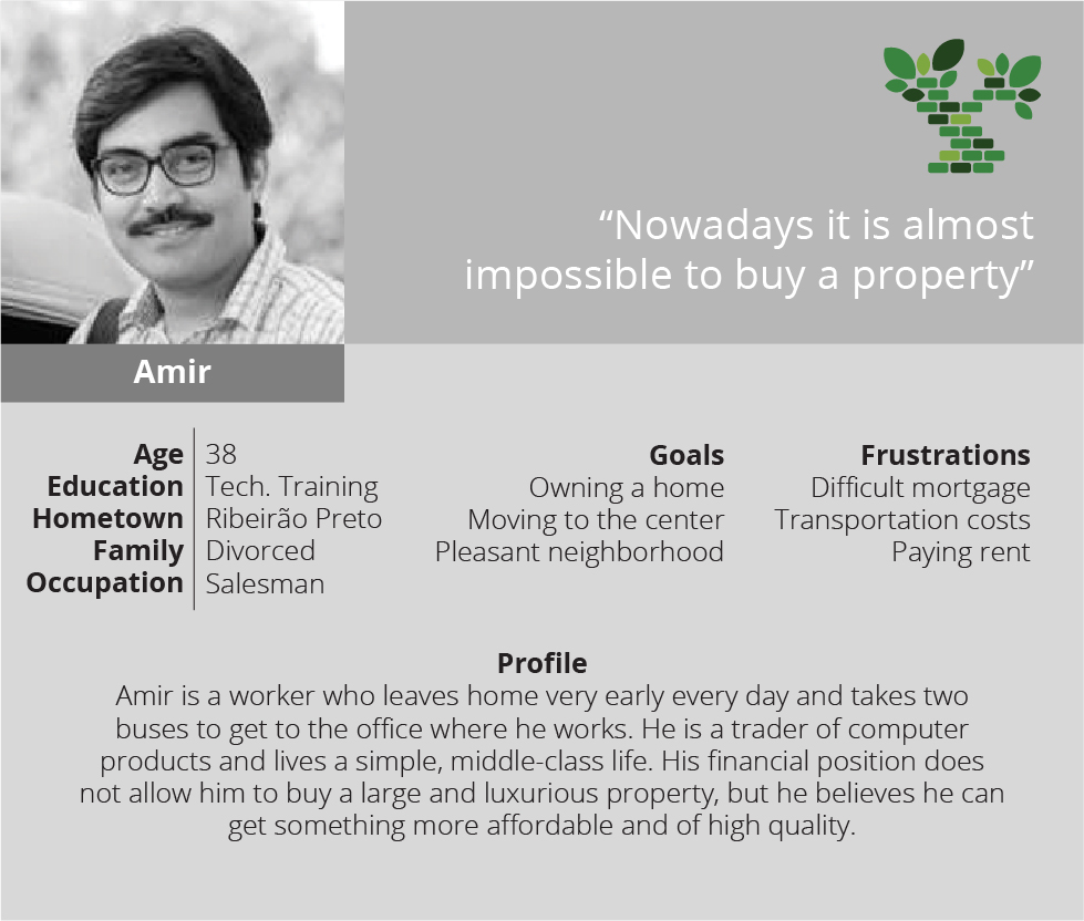
User Story (potential client): "As a POTENTIAL CLIENT, I want to FIND GOOD REAL ESTATE OFFERS, so that I can BUY AN APARTMENT AND GET AWAY FROM RENTAL".
Problem Statement (potential client): "Amir, who is a potential company client, needs a digital tool for quick and easy finding of his dream property".
| INITIAL DESIGN CONCEPTS |
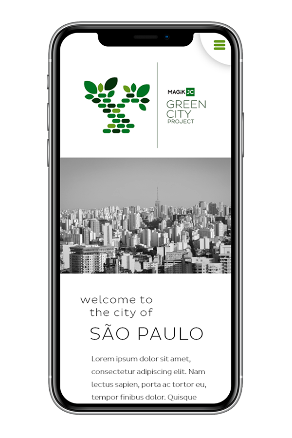
Most users search for real estate on a computer, because it has a larger display and can show photos in a magnified size. For this reason, a starting point was set on a desktop screen, and then a responsive adjustment for a cell phone (graceful degradation). The idea is a single large scrolling page for the full version, which will be divided into subsequent smaller screens in the mobile one.
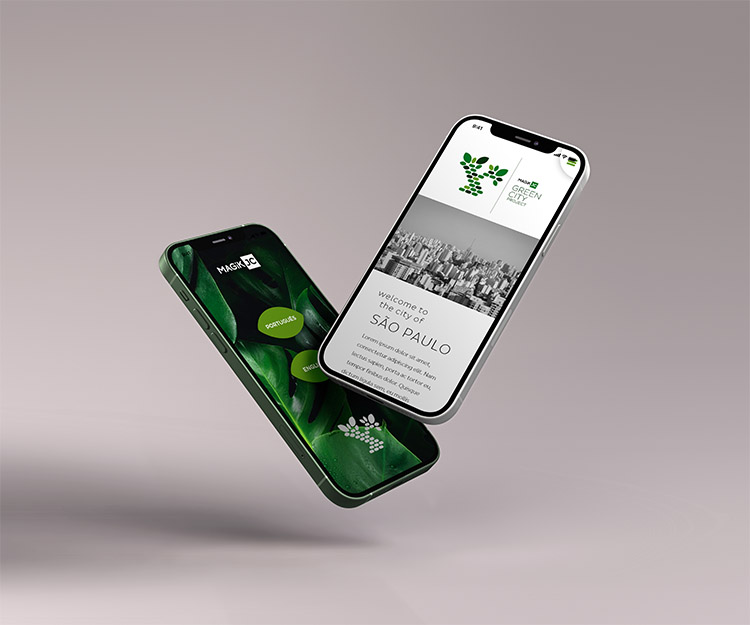
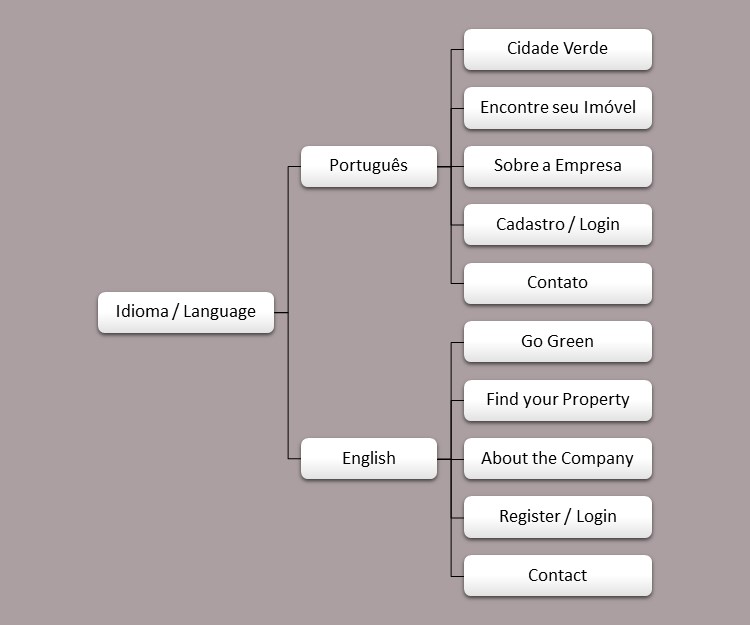
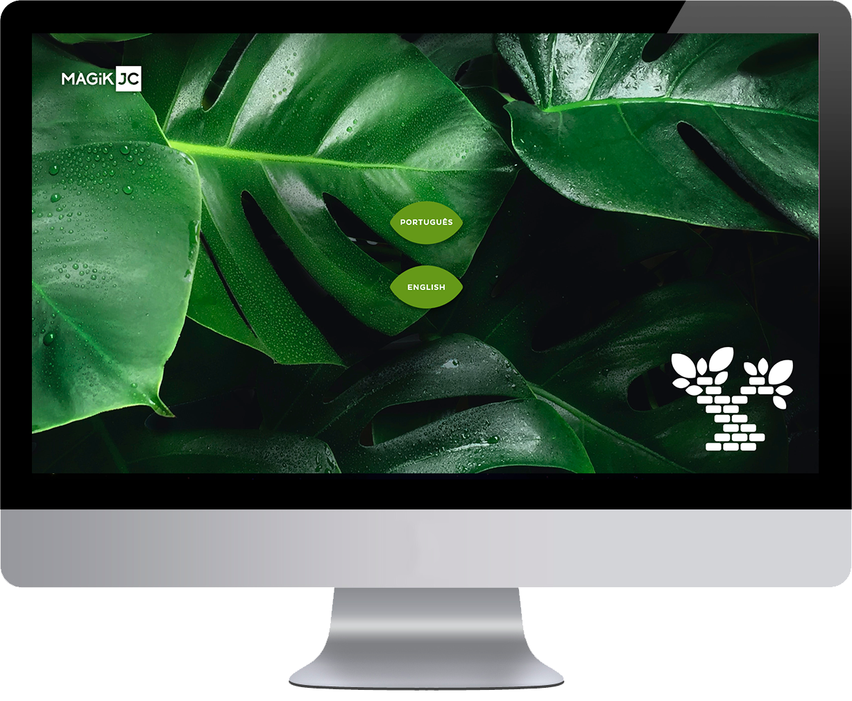
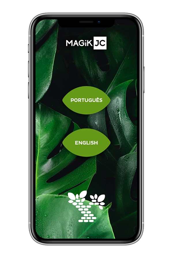
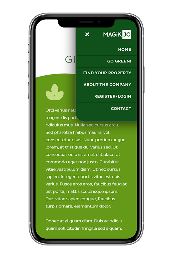
As São Paulo is a cosmopolitan city, the project is bilingual.
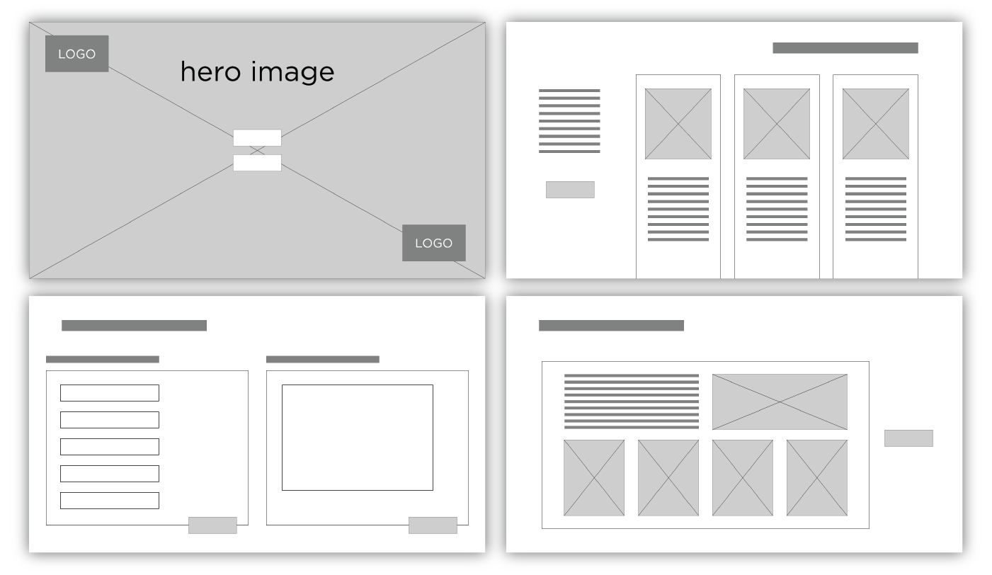
A competitive audit was done, bringing significant observation points to the launch of the campaign. Then the first storyboard ideas (for the user journey) and the "crazy 8s" were drawn. Below are some screenshots of the wire-frame mock-up.
| USER INTERFACE AND PROTOTYPE |
Used software: Adobe XD, Illustrator and Photoshop + Microsoft Office.
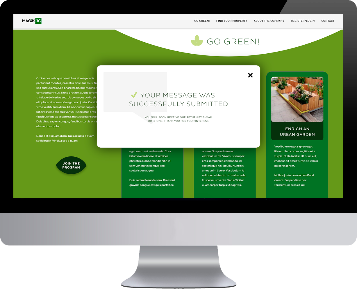
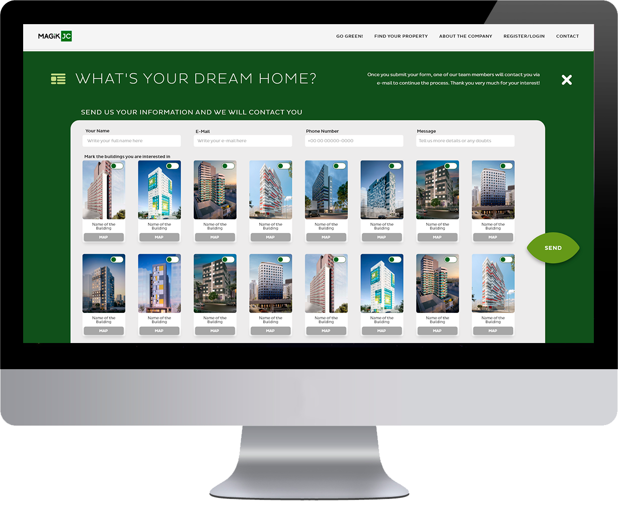

All screens and pop-ups:
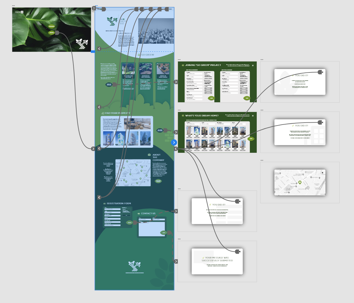
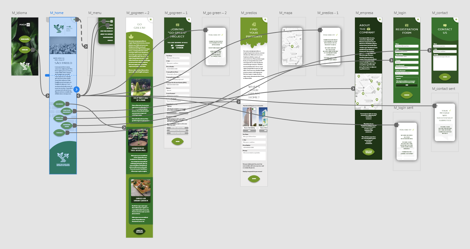
Prototype simulation:
DESKTOP VERSION:
Watch the video on Youtube: LINK
Control yourself the navigation of this prototype, in XD: LINK
MOBILE VERSION:
Watch the video on Youtube: LINK
Control yourself the navigation of this prototype, in XD: LINK
Custom icons, colors and images for this project:
![]()
![]()
| USER TESTING RESULTS AND CONCLUDING REMARKS |
DESIGNER'S REVIEW
It was very interesting the possibility to bring a freshness to a subject as arid as buildings in downtown São Paulo. The project of parks and gardens broke some of the weight of the concrete and harmonized both the look and the user experience in the app.
It was also a delightful branding and design job to create the new brand and identity for the project.
USERS' REVIEWS
Considerable improvement in the quality and size of images, as well as faster and better-structured navigation. Still possible to enhance the contrast of colors and graphic elements.
It could adjust the height of the contact page so that it doesn't need to scroll down, although each device will have a different height - it's worth a try.
UP NEXT
Although it is an audacious project, it is worth trying to convince the client to use the new logo (the one with the typeface of the company name, not the design of the tree project) to be their official brand, since the current design is very dated and old-fashioned.
Possibly we will still make a tablet version, with minor adjustments to the aspect ratio.
rogerweikers.com - 2026 Copyright ©
Home | Overview | Aimores | Telesys | Sindilub | Petrol | Magik JC | RW Gallery | Studio | Contact | Top